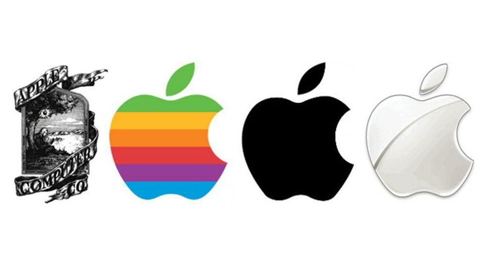
Today, the Apple logo is one of the most commonly recognized logos in the world. Anyone who uses an iPhone, iPad or Mac sees the logo on a daily basis. Years ago, however, the Apple logo looked much different. When the company was first created, the logo was a picture of a man sitting under an apple tree that had just one apple on it. There was a ribbon around the photo that read, Apple Computer Co. Years later, the company decided to simplify the logo.
#2 Starbucks
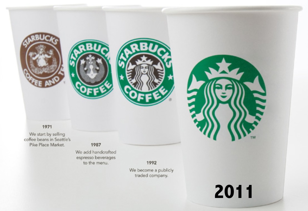
The Starbucks logo is very recognizable, especially for those who wait in line each day for their coffee. The original logo looked much different. It was in black and white and the woman looked slightly similar. The logo read Starbucks Coffee Tea Spices. Today’s logo has been simplified and the words have been taken out. They changed the black and white to green and white and the woman in the logo has been modernized.
#3 Walt Disney
Walt Disney is famous for creating some of the best children’s movies in history. Years ago, when you watched a Disney movie, you saw the yellow logo that read, Walt Disney. Later, the company decided to simplify the logo. They changed the yellow color to black and they took out the name Walt. Today’s logo just reads Disney and it is similar to the word Disney in the first logo. They just changed the letter D a bit.
#4 Google
The old Google logo is similar to what it is today, however, the company modernized it a bit and it changed many times. The original logo was created in 1997 and the letters were flat. In 1998, the letters were standing up and they were written in Times New Roman. In 1999, an exclamation point was added to the end, which was removed in 2010. In 2015, the logo that we know today was created. The order of the letter colors have changed and the letters were thicker. In 1998, the first Google Doodle was added to the logo for the day in honor of the Burning Man Festival.
#5 Lego
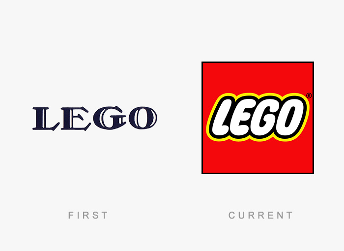
Lego is a brand of children’s blocks, therefore, the logo should be fun. The first Lego logo wasn’t fun at all. It was in black and white and it read, Lego, in fancy writing. Later, the company execs finally realized that the Lego logo wasn’t fun, therefore, they changed it. The letters were changed to bubble letters. They used a red background and the black in the letters is now highlighted with yellow. It is much easier to tell that Lego is a company that makes children’s toys.
#6 Amazon
The original Amazon logo was shaped like a block letter A. In the middle, it had a white road going through it. This was to show shoppers that their packages get delivered. Under the logo were the words amazon.com. Later, the logo changed and it is much more clever than the first. The logo reads amazon.com in large black and white letters. Under the word, Amazon is an arrow. Some people believe that the yellow arrow is a smile. It is actually pointing from the A to the Z. This tells shoppers that Amazon has every item available from A to Z.
#7 Ford
The very first Ford logo was fancy and a bit complicated. It was a black circle with fancy white designs in the outline. In the middle of the logo were the words Ford Motor Co. Detroit, MICH. This was a lot to put on each vehicle so the Ford Motor Company decided to simplify their logo, making it more modern and recognizable. Today, the logo is a blue oval with just the word, Ford inside in white letters.
#8 Twitter
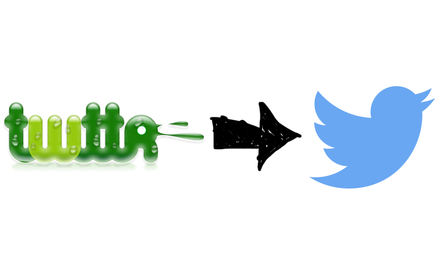
Most people don’t know it, but when Twitter was first started, it had a very different logo than what it has today. The first logo was green and it read twtta. Next, it was changed and the letters were blue and it just read, twitter. In 2010, the company wanted to signify the tweets that people send on Twitter, so they added a blue bird to logo and they changed the lettering from blue to black. In 2012, they decided to simplify the logo and getting rid of the words and they used just the bird.
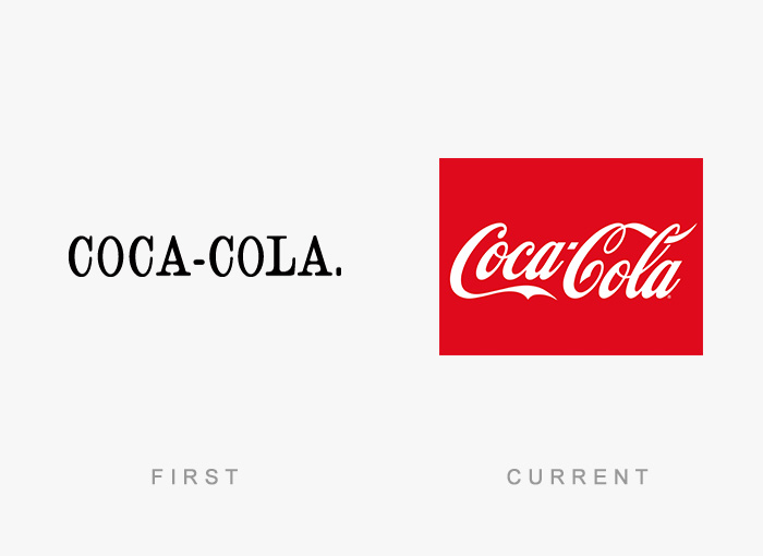
#9 Coca-Cola
Coca-Cola has been around for decades. The very first logo was very simple and plain. It just read Coca-Cola in black and white with a period at the end. The company execs realized that this logo was too plain. They changed it to the red and white colors that you recognize today. The letters also changed. They went from block letters to fancy cursive writing. The Diet Coke logo uses the same lettering but different colors.
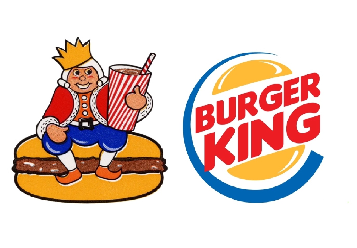
#10 Burger King
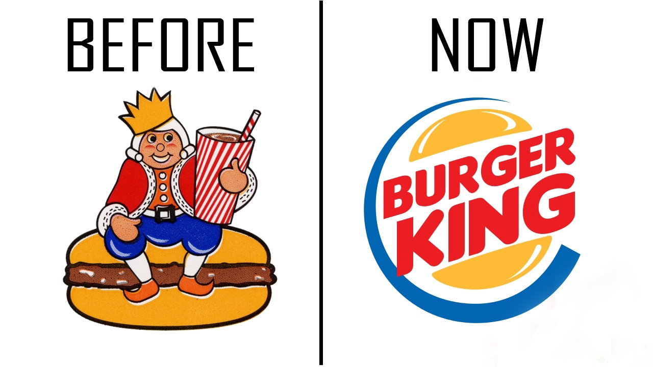
Of the 10 famous logos before and after, Burger King has changed the most. The original logo showed a white-haired cartoon king sitting on top of a burger. In his hand was a stripped cup with a straw holding a soft drink. Over time, Burger King execs realized that the logo was just too complicated. Today, it is simple and more recognizable. On the top and bottom of the word, Burger King are yellow buns. The logo is outlined with a half blue circle. It is much more simple than the original.
