#1 McDonald’s Golden Arches
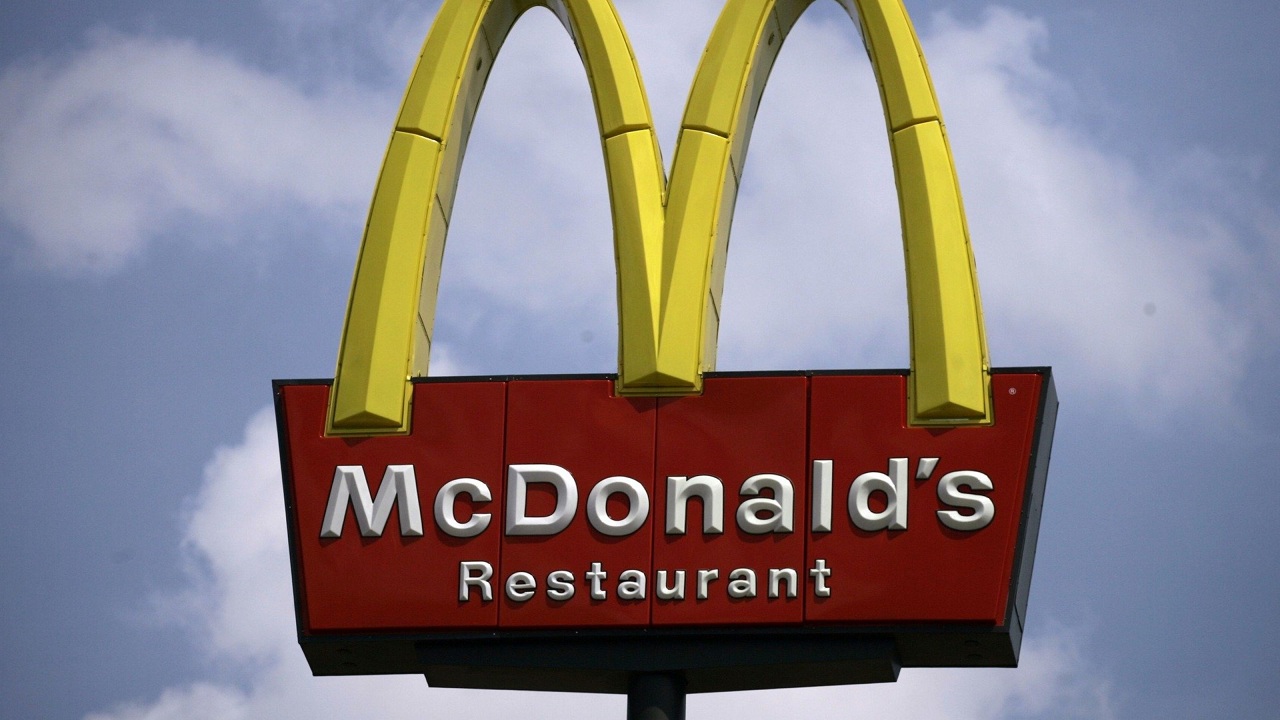
Everyone knows that the Golden Arches represent the “M” in the name, McDonald’s. Most people believe that that is just what is is, the M. Back in the 1960’s, a design consultant and psychologist named Louis Cheskin said that when customers say the Golden Arches, that they unconsciously saw the logo as a pair of nourishing breasts. According to Cheskin, anyone who was breastfed would have an automatic reaction to the Golden Arches.
#2 Baskin-Robbins

Millions of people love Baskin Robbins ice cream. At first glance, the logo looks like a BR, which many people believe stands for Baskin Robbins. If you look closely, there is a 3 in the B and a 1 in the R. This represents the 31 flavors of ice cream that Baskin Robbins offers on their menu. If they come up with one more flavor, the logo will no longer make sense.
#3 VAIO
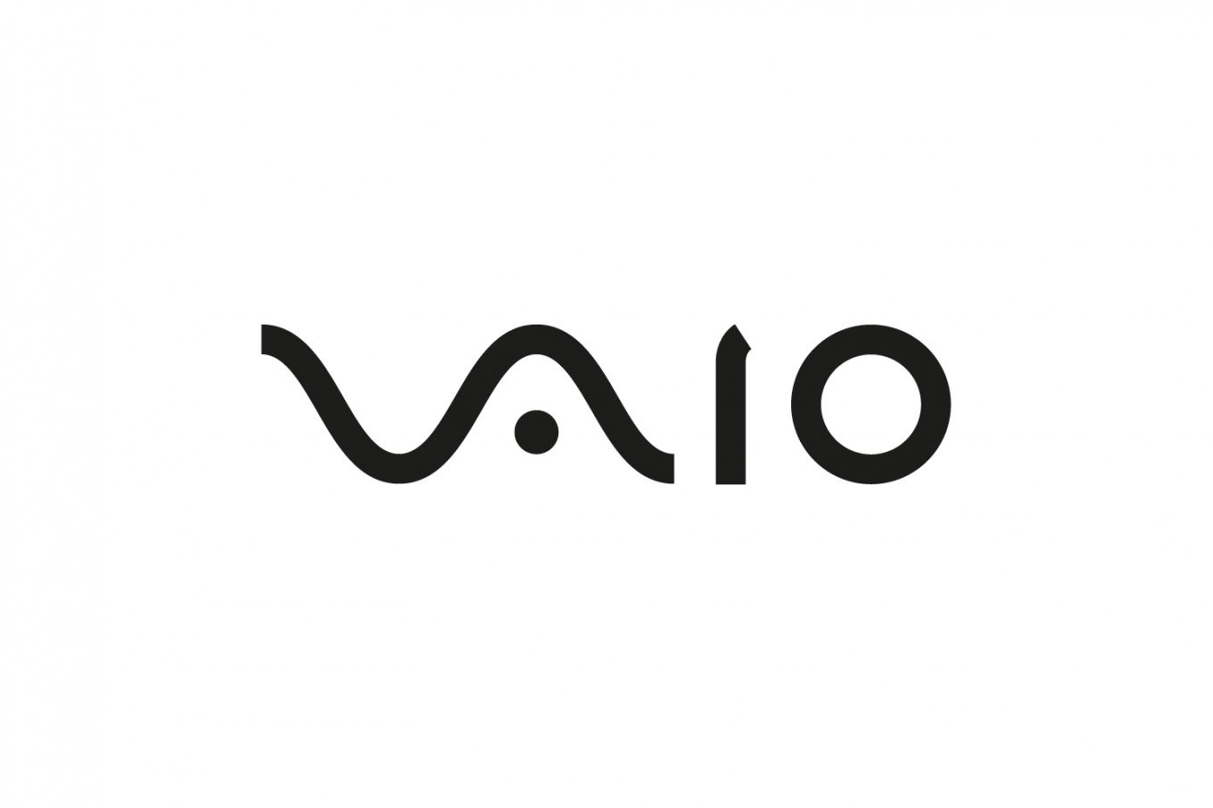
If you have ever seen the VAIO logo, chances are you see it as just a cool way to spell out the company’s name. If you are a computer nerd, however, you will see it completely differently. The first two letters represent and analog symbol and the second two letters are binary symbols.
#4 Amazon
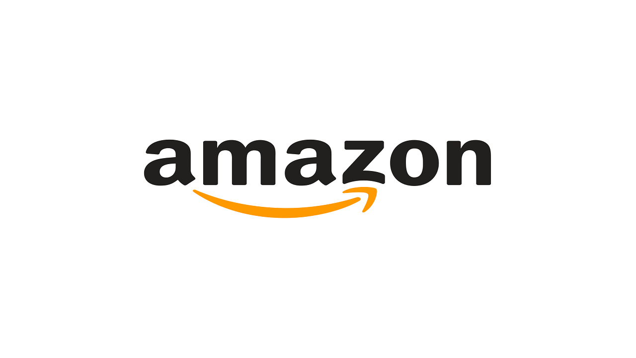
Over the years, Amazon has become incredibly popular and its logo is very noticeable. Most people look at the logo and see the arrow underneath and assume that it is a smiley face. While it looks like a smiley face, it is actually an arrow. If you look close, you will see that the arrow goes from the A to the Z. They are trying to tell you that they sell just about everything from A to Z.
#5 Tostitos
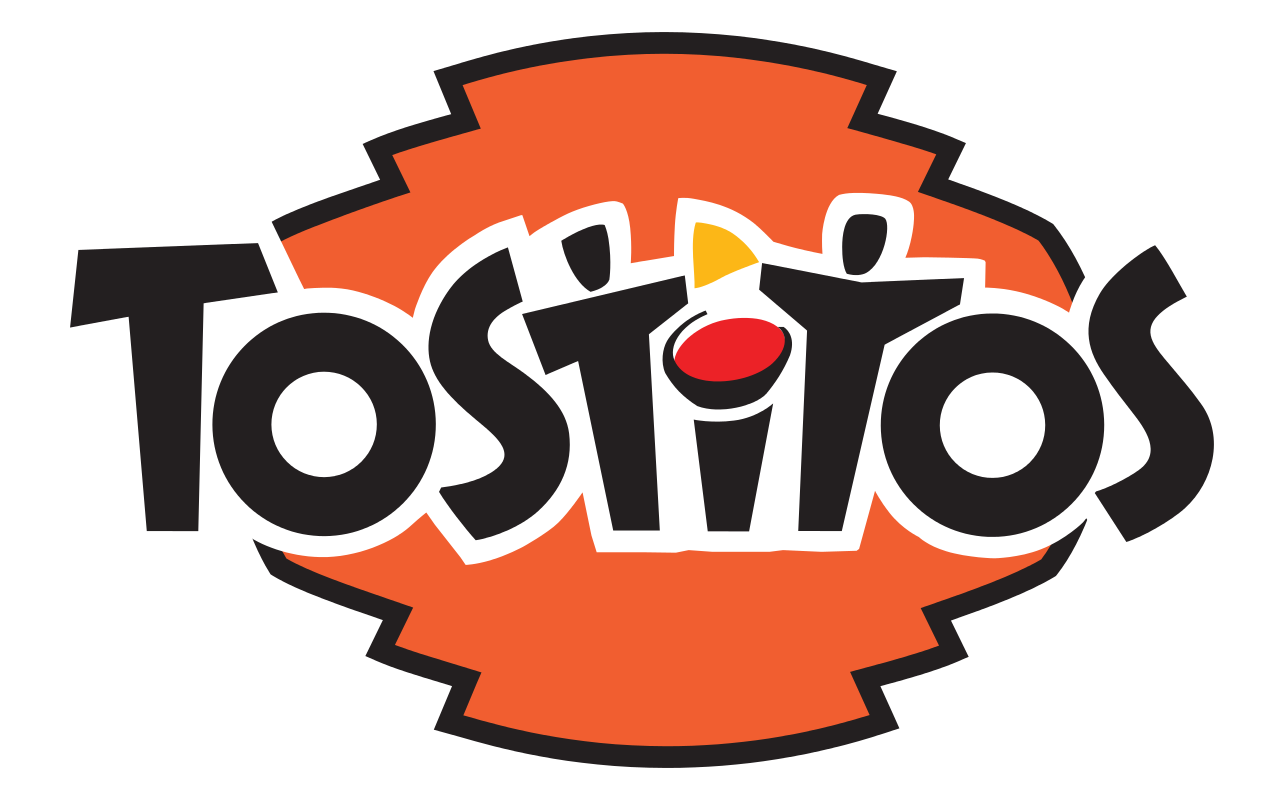
Everyone who has gone to the supermarket has seen a bag of Tostitos. Even is you haven’t tried them, you have likely seen them set up in a display by the door. At first glance, the logo just looks like it is spelling out the brand’s name. If you look closer, however, it is much more. If you look at the two T’s in the middle of the name, you will see that it is two stick figures sharing a chip. Now that you know, you are likely wondering how you never noticed it before.
#6 IBM
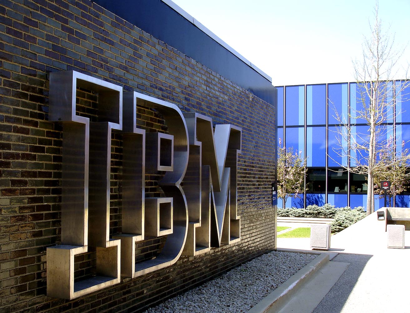
IBM’s logo is famous. If you have ever walked through the electronics department at your favorite store or have seen an IBM commercial, you have seen the logo. Most people believe that the broken up blue lines of the logo simply spell out the name. There is actually a hidden meaning in the lower right corner. If you look close, you will see an equals sign. This is to represent equality.
#7 Toyota
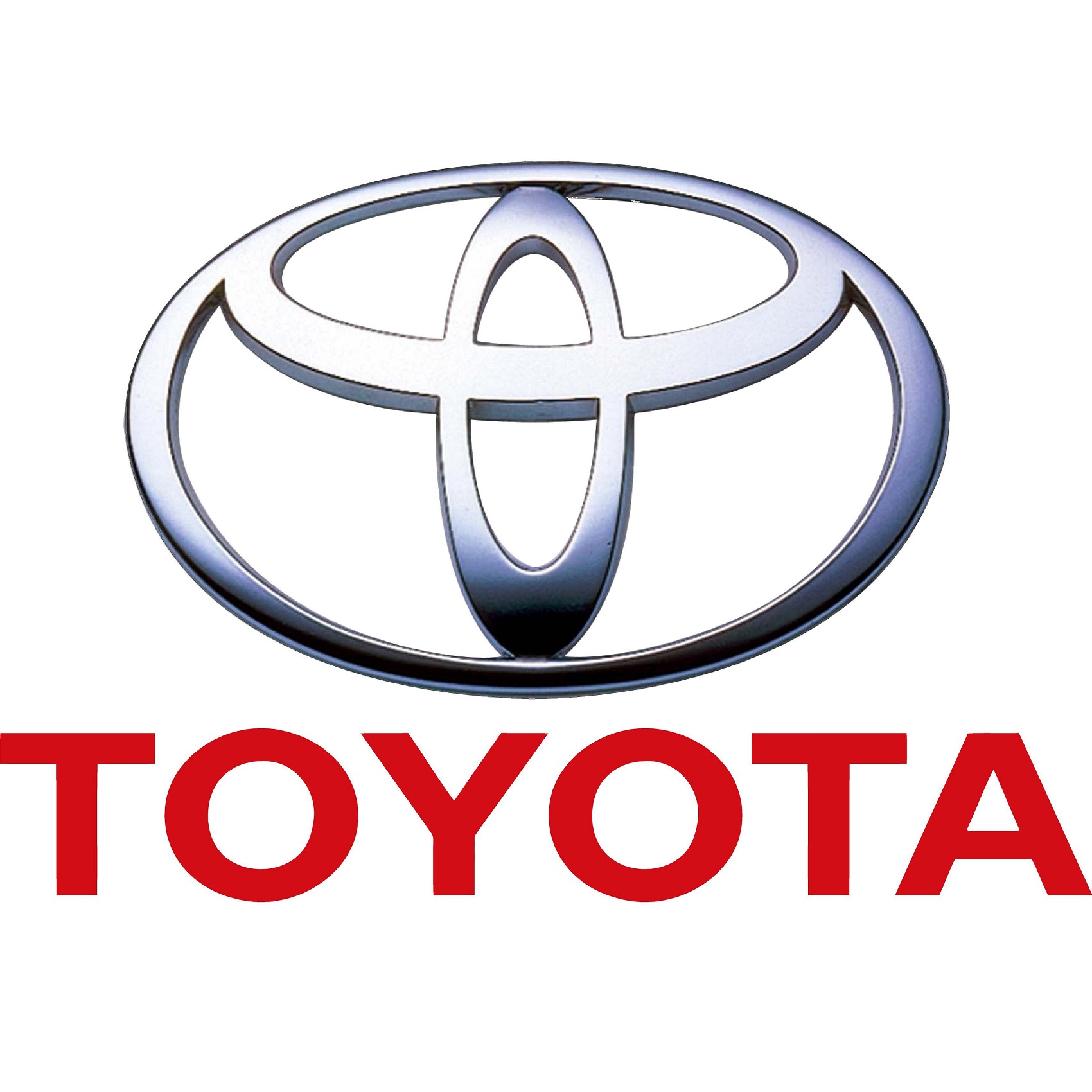
The Toyota logo isn’t just some design that an advertising agency thought up to make the brand recognizable. The three ellipses in the logo actually represent something. The first represents the heart of the customer. The second represents the heart of the product. The third represents the progress in the field of technology. These the three foundations of the company.
#8 Wendy’s
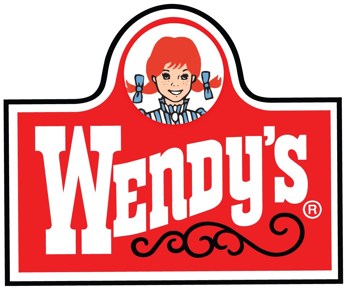
Anyone who has seen the Wendy’s logo and the Wendy’s commercials believes that the logo is to represent the red-haired daughter of the owner, Dave Thomas. This is partly true. If you look closer, at the collar of the red-haired girl’s shirt, you will see that it spells the word, “Mom”. This is to let customers know that Wendy’s food is as close to your mother’s home cooking that you are going to get.
#9 The Bronx Zoo

When you look at the logo for The Bronx Zoo, it looks like two giraffes standing side by side, with a few birds flying close by. Upon first glance, you just think that these animals represent the animals that you can visit in the zoo. If you look closer, you will see that in between the giraffe’s legs, it is buildings. This represents the fact that the zoo is located in New York. This is a logo with a double meaning.
#10 FedEx

The FedEx logo looks like the name spelled in two bold colors to grab your attention. The logo is actually more clever than that. If you look between the E and the X at the end of the logo, you will see an arrow in the white space. This is there to let the consumer know that the company is always looking toward the future. They are a forward thinking company and they want you to know it.
#11 The Presbyterian Church

This is one of the most clever hidden messages in famous logos. If you look at the logo for the Presbyterian Church, it looks like a symbol that was designed to grab your attention. It is not until you look deep into the logo that you will see that there are several symbols withing the symbol. Each of the symbols represents the church, and they include the cross, the pulpit, the dove, the fish, the cup, the fire, the book, and the trinity. It is actually one of the most informative and creative logos.
#12 NBC
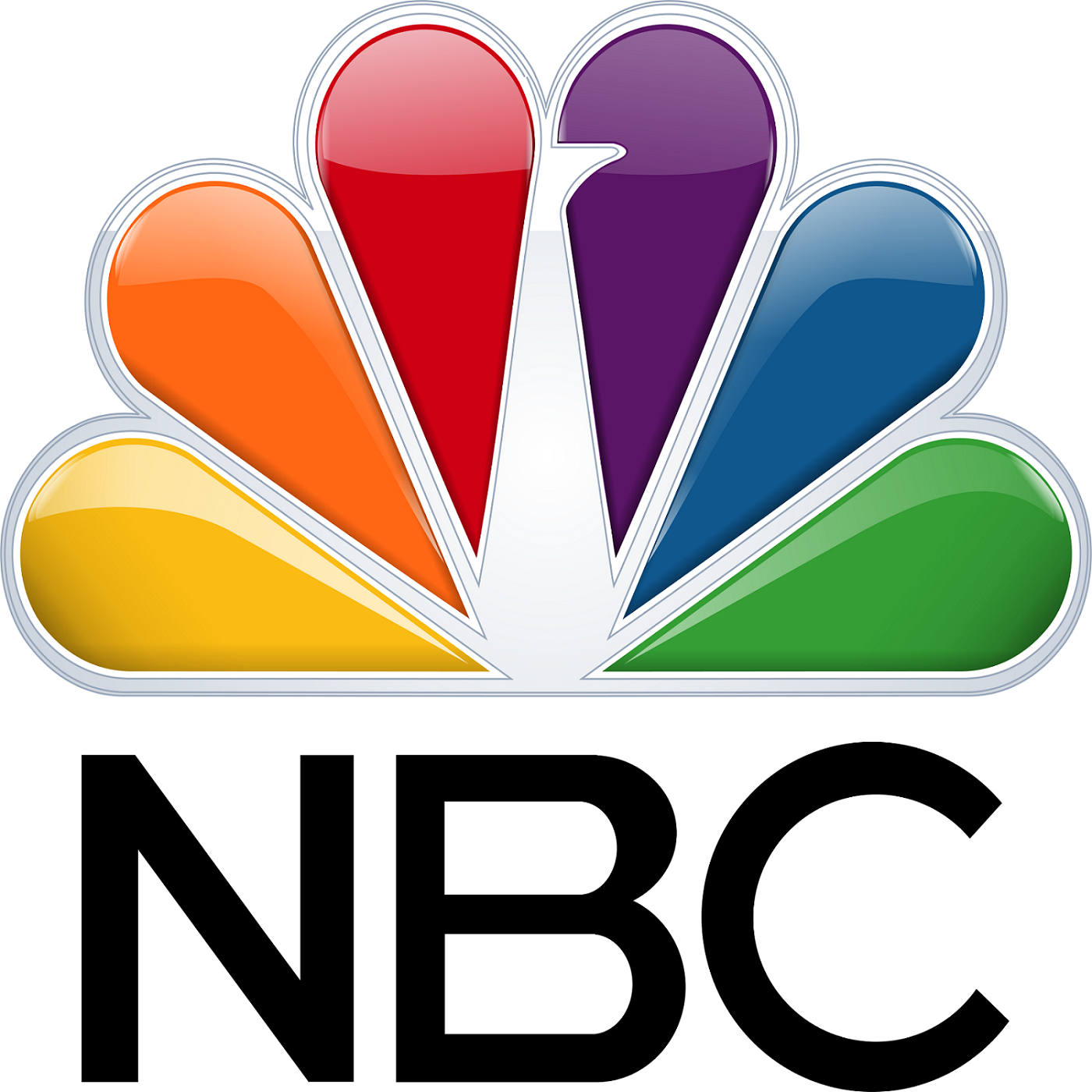
Everyone knows that NBC’s logo is a peacock. If you are old enough, you likely remember their slogan that the station was “proud as a peacock. What you may not know is the purpose of the multiple colors in the symbol. During the 1950’s, NBC was owned by RCA. This is at a time when the company was beginning to sell color televisions. They put all of the colors on the peacock so that people who were happy with their black and white televisions would realize what they are missing